Role: UI/UX Designer (Project Lead)
Tools: Figma and After-effects
Project Description: The task was to re-design an overview page for a multi-page dashboard summarizing the status of Maryland’s transportation system. The goal was to highlight when conditions were out of the ordinary and required immediate attention. It was designed for display on large-scale monitors, as well as exploration on desktop. The dashboard is currently used in Maryland’s Lieutenant Governor’s office.
Design: I led the redesign of a transportation overview page that originally featured shifting cards to highlight system issues. The initial layout suffered from a muddled hierarchy and a color scheme that did not meet the client’s expectations. After exploring various data visualizations, I implemented a streamlined bar chart to improve clarity.
The primary goal was to prioritize 'abnormal' conditions while maintaining visibility for standard operations. I developed a high-contrast color scheme using neon pink for critical issues and a neutral dark blue-gray for normal conditions. This approach ensured that urgent congestion and system failures immediately captured the user's attention while less critical information recedes into the background.
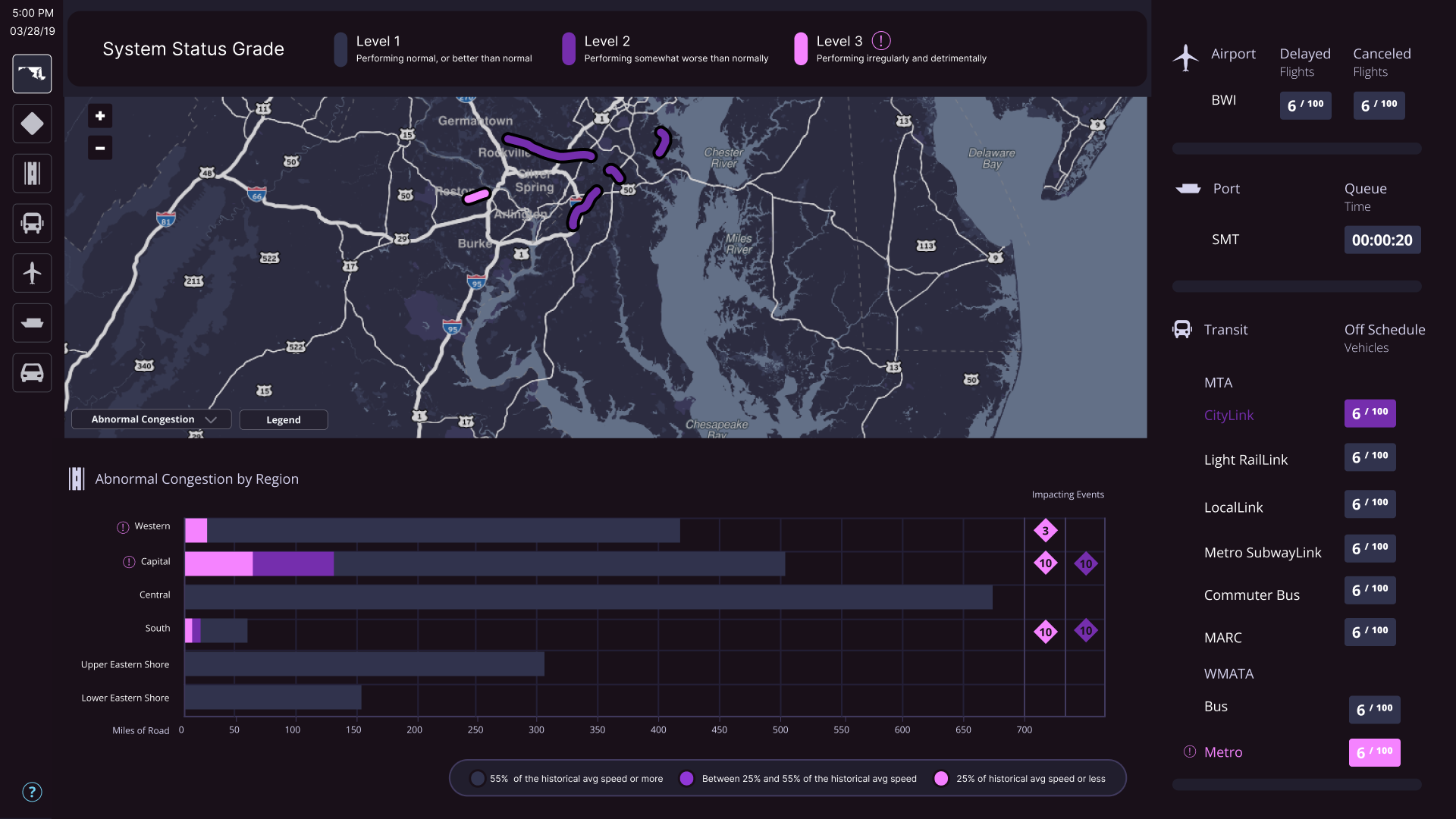
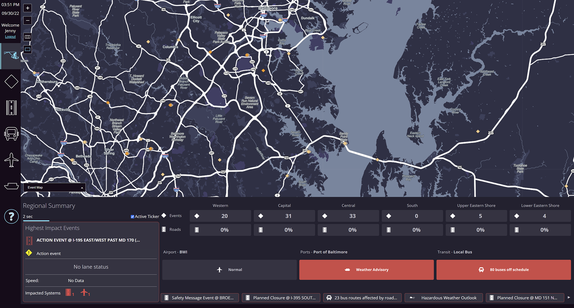
The Before The image below was the original design. My approach was to increase clarity using simplicity by increasing the color contrast and changing the graphics and metrics that we used.