Purpose
I am the sole creator of this project. The final result is a redesign of a project from a university course. I really enjoyed learning about edible insects and was inspired by the business market. I decided to do a redesign in 2021 because I felt I could come up with a better marketing strategy.
Background
Edible insects are a vastly underused food resource, as insects are cheaper and more sustainable to farm. Additionally, insects have a high protein content and are chalked full of diverse vitamins and minerals. However, the western market, specifically in the U.S.A, there is a strong aversion to edible insects.
Challenge
In order to circumvent the U.S.'s aversion to edible insects, we must turn them into a luxury item. Luxury items are one of the areas that Americans seek novelty in, especially if it's more expensive and harder to find. Sago is a luxury chocolate company that sells dark chocolate with pieces of the Indonesia sago worm inside it (also known locally as Butod). This insect was chosen because of its strong flavors that meld well with dark chocolate.
The audience for this chocolate bar is the same as luxury chocolate buyers, which is a diverse population, but socioeconomically tends to be somewhat wealthier. The focus of the branding is specifically on the flavor and health benefits of the insect, not the cheaper production.
Role
Brand Strategy and Visual Design
Date
2021
Tools
Illustrator, Photoshop
Solution
Sago chocolate seeks to make it clear to the consumer that its chocolate is a luxury good. The packaging design is based off of a user study report on chocolate bars.
Firstly, the report finds that packaging is the most important factor to the premium chocolate consumer. The factors that premium chocolate buyers look for is a handcrafted quality, the color gold, thick gold tin foil, nostalgia, foreign made (not made in America), and some kind of story or narrative. It is also important to note two other factors: price and location. In order for these chocolates to be considered luxury to this market they need to be expensive and in select locations; it cannot be in the average grocery store or convenient store.
This data was referenced from this study: https://journals.plos.org/plosone/article?id=10.1371/journal.pone.0240177
Packaging
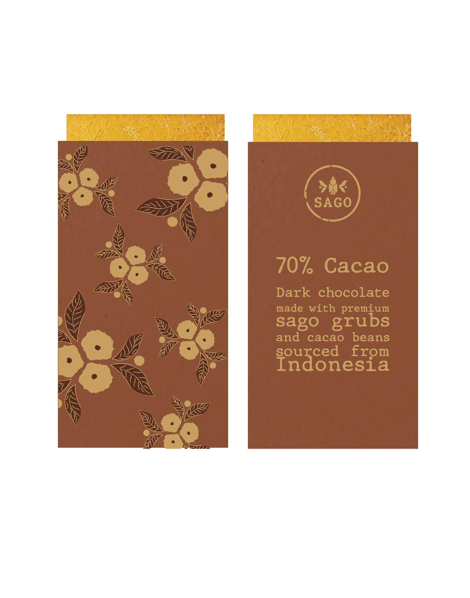
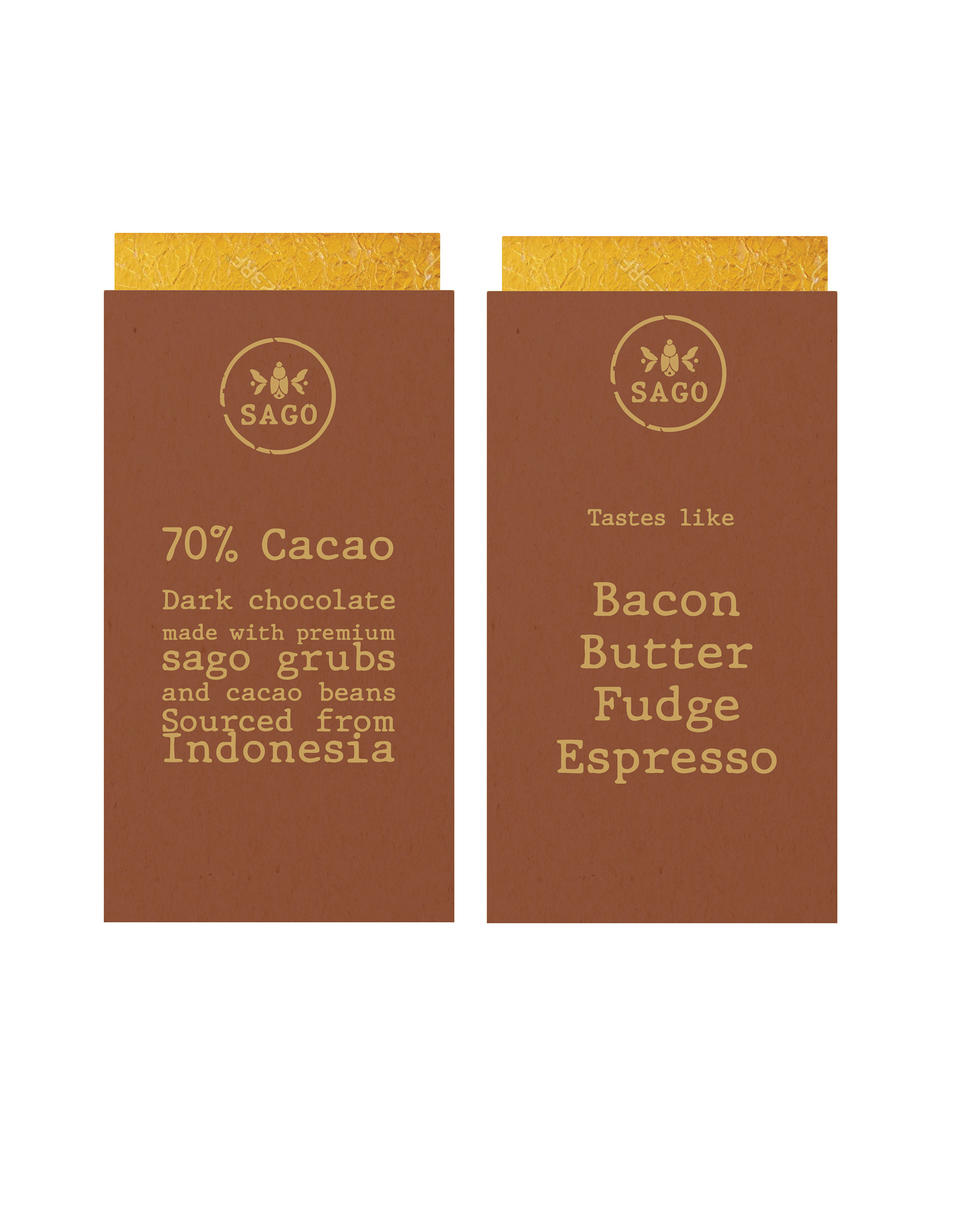
The outside package is made from a thick recycled card stock with gold leaf lettering and designs. That texture makes the bar stand out from plastic wrapped chocolate bars and creates a hand crafted organic experience.
Additionally, the design on the outside is of the sago beetle and gives a nod to the insect presence in the bar as well as tries to cultivate a kind of elegance in the brand. The description on the back of the bar seeks to underscore the bars' relation to Indonesia from the cacao bean to the grub to give the consumer the idea that the chocolate bar is of Indonesian origin.
Additionally, this wrapping seeks to make it clear that there are grubs inside the chocolate as it is proud of its inclusion which serves to create trust with the consumer, make it seem like a premium good, and adds to the novelty of the bar.
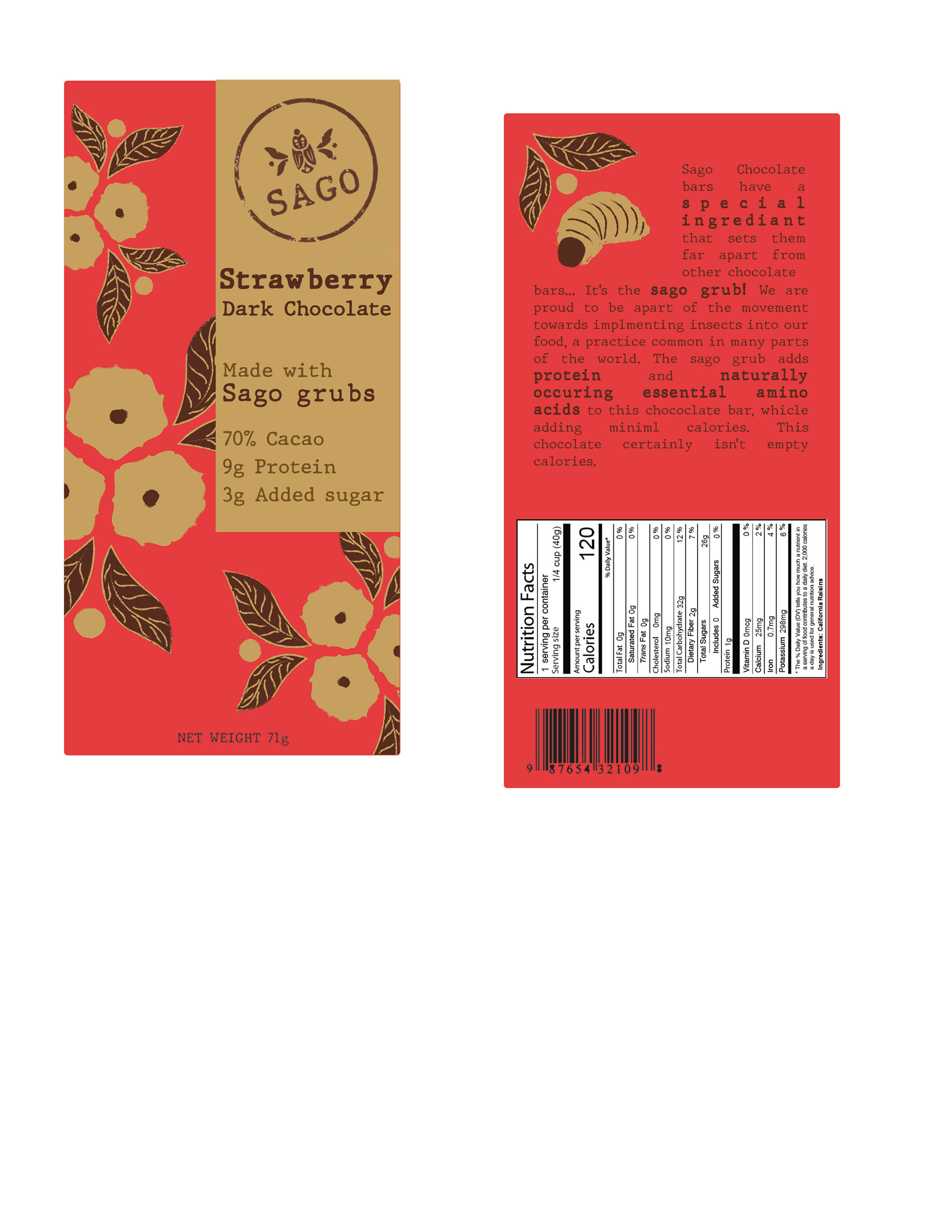
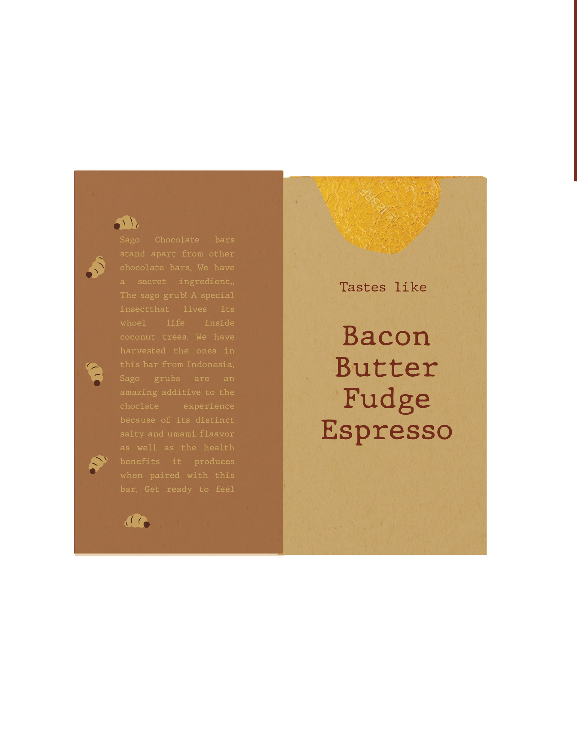
The wrapper opens up like a book and on the inside it makes the thick gold tin foil visible as well as prominently displays the flavors of the chocolate bar. Additionally, the flap tells the story of the sago grub why it's used in the chocolate to demonstrate that the grub is a necessary additive elevating the chocolate.
Construction
Business System
Graphic Standard
Exploration and Iteration
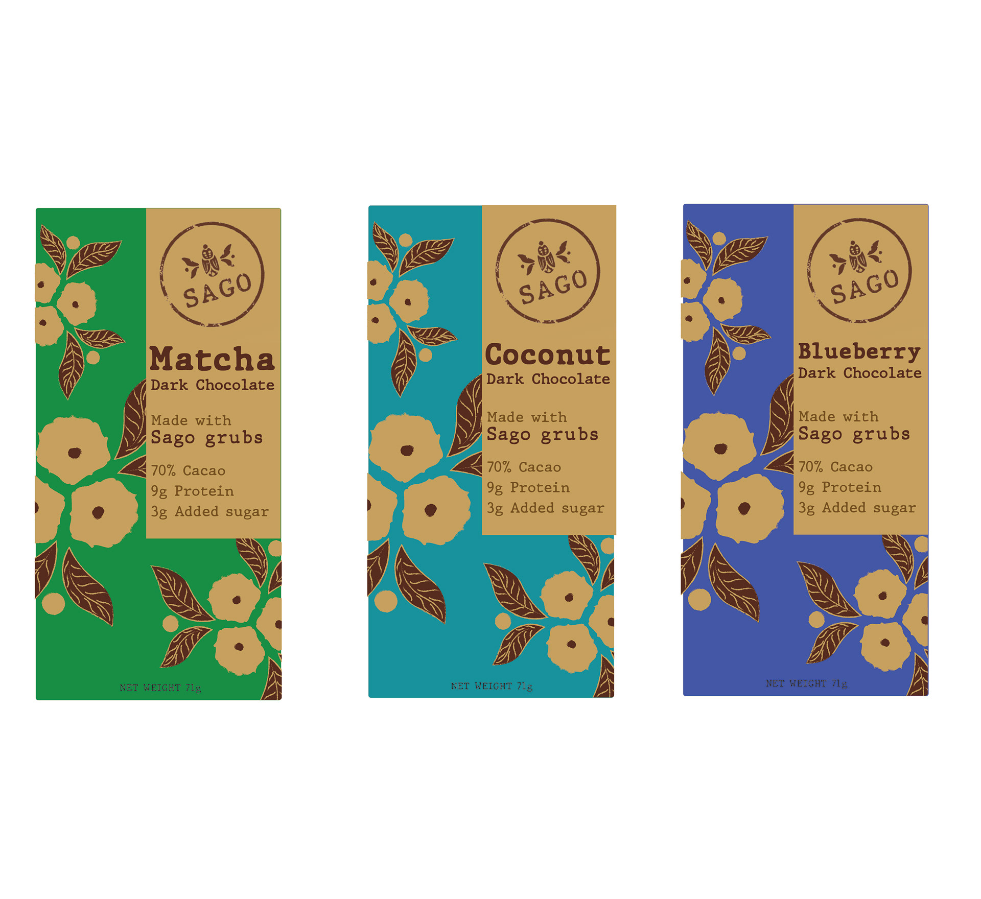
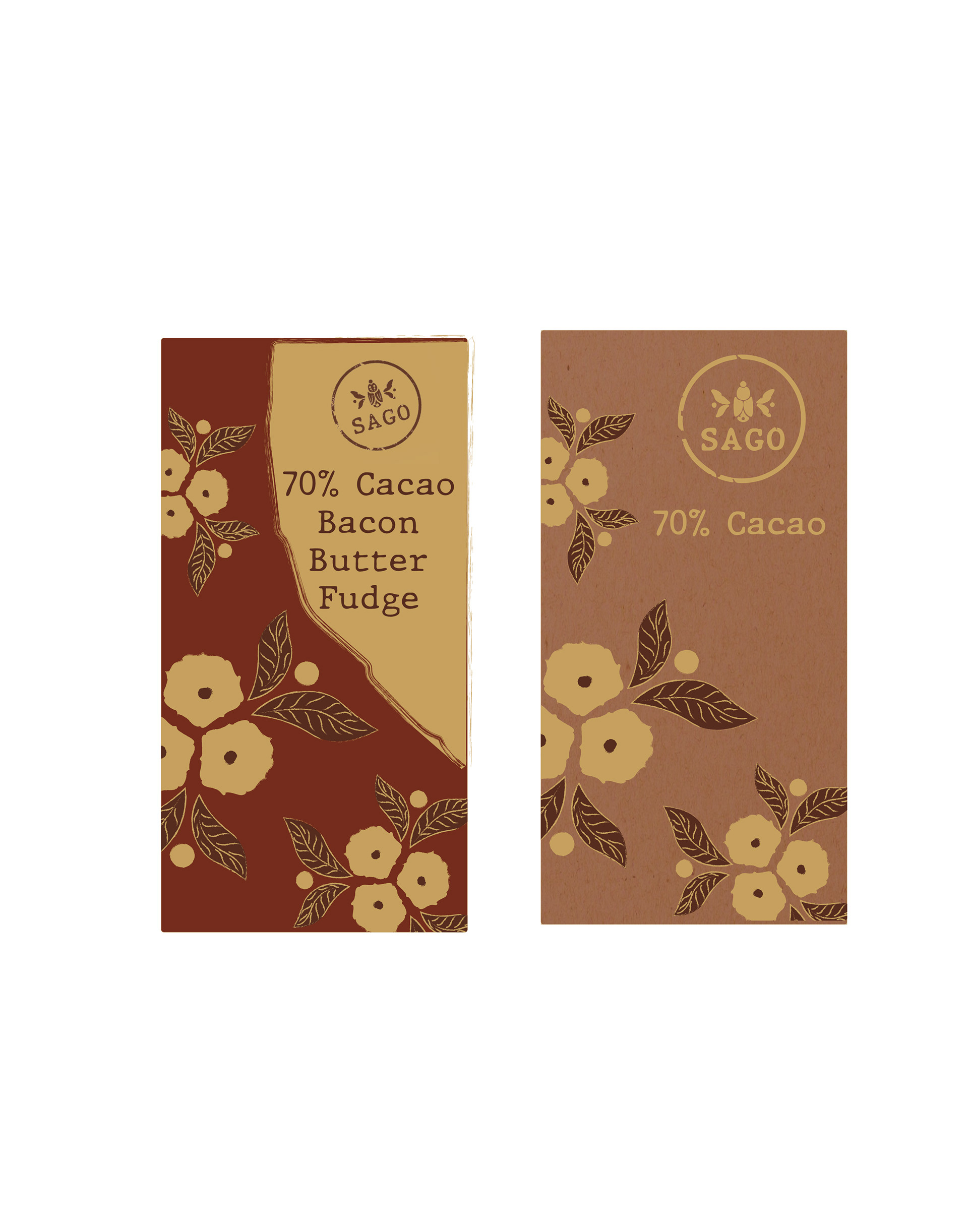
The project evolved from the more colorful versions. From there, I kept iterating and slowly minimalized, tried a new pattern, and brought in texture which made the packaging feel both more organic and luxurious. It was difficult to move away from the flower pattern I developed, but I realized that it was boxing me in and I was trying to fit it into the brief. I felt the design was not elegant enough. I wanted to underscore the sago worm and I wanted the packaging to feel more mysterious.
Original Project from 2019
Originally the product was spiced and flavored sago worms that would be marketed as a snack to Whole Foods shoppers with its sustainability factor heavily emphasized. The packaging was even going to be made from mycelium, which is biodegradable. However, the idea needed to be improved upon because it did not take into account how it was too much novelty for what was supposed to be a cheap snack. Furthermore, snack packaging needs to be eye catching and speak to the senses and this packaging does not execute that effectively.
Originally the product was spiced and flavored sago worms that would be marketed as a snack to Whole Foods shoppers with its sustainability factor heavily emphasized. The packaging was even going to be made from mycelium, which is biodegradable. However, the idea needed to be improved upon because it did not take into account how it was too much novelty for what was supposed to be a cheap snack. Furthermore, snack packaging needs to be eye catching and speak to the senses and this packaging does not execute that effectively.
