My Role
I came onto the project when it was time to begin development. I conducted usability tests, translated the designs into high fidelity prototypes, made motion graphic animations, designed new interactions, and worked with the developers to make sure the product followed the spec.
team
2 Designers, 1 Project Manager, and 7 Developers
Date
2021
tools
XD, Illustrator, After-effects
Today there are many initiatives in place to encourage the adoption of electric vehicles(EVs). However, It's difficult for consumers to compare cost differences between gas and electric vehicles. This creates apprehension and misinformation around owning electric cars. Vehicle cost calculators(VCCs) could be the perfect tool to educate consumers about these benefits.
Purpose
This project was commissioned by cEnergi Lab , a subsidiary of the Institute of Transportation Services of University of California, in association with the UC Davis Plug-in Hybrid & Electric Vehicle (PH&EV) Research Center and the National Center of Sustainable Transportation
Background
EV Explorer 1.0 is a vehicle cost calculator (VCC), developed by the National Center for Sustainable Transportation, that enables users to compare costs for different vehicles based on their own commuting patterns, charging opportunities, vehicle mileage, and local fuel prices.
Project Goal
Develop a new VCC building from the data found in developing EV Explorer 1.0. This tool will emphasize the benefits of owning an electric vehicle by showing the full cost of ownership. This will be EV Explorer 2.0.
EV Explorer 2.0 Project Scope
I designed interactions 2.A, 2.B, 2.C, 2.D, and 2.A, highlighted below.
1. New user interface design
2. Detailed and accurate cost calculations
A. Emphasize EV benefits (e.g., highlight operational cost savings for an EV vs. similar ICEV)
B. Compare cumulative total costs overtime, highlighting breakeven time
C. Integrate salient, emotionally-evocative information about social and environmental impacts
D. Provide up-to-date federal, state, and local incentive estimates
3. Improved user experience based on findings
A. Enable comparison of at least 4 vehicles
B. Require some driving inputs, designed to estimate total mileage accurately or generously
C. Communicate the implications of daily driving (between charges) for PHEV fuel costs
D. Provide optional charging inputs to factor in time-of-use and multiple public chargers
E. Include optional inputs for new and used vehicle acquisition costs
F. Required user inputs should be relatively minimal and high leverage for tailoring output
G. Maximize optional user inputs to maximize ability to tailor results
Layout & Flow
I worked on parts of the visual design, but I primarily focused on designing the interactions for the output section.
Project Highlights
Usability Tests
When I came onto the project many of the screens had already been designed by another designers. I decided to audit the original designs.
I interviewed five individuals with driver's licenses between the ages of 21 - 68. I had them interact with the prototypes and watched them as they talked about their experiences navigating it. Below are the designs I used in the prototypes.
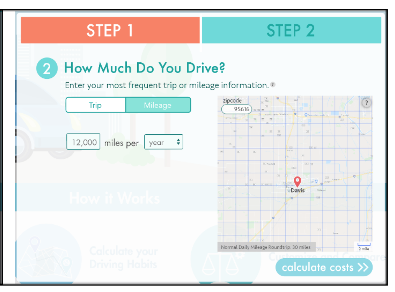
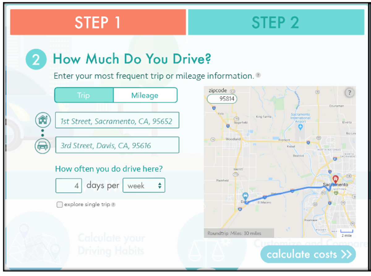
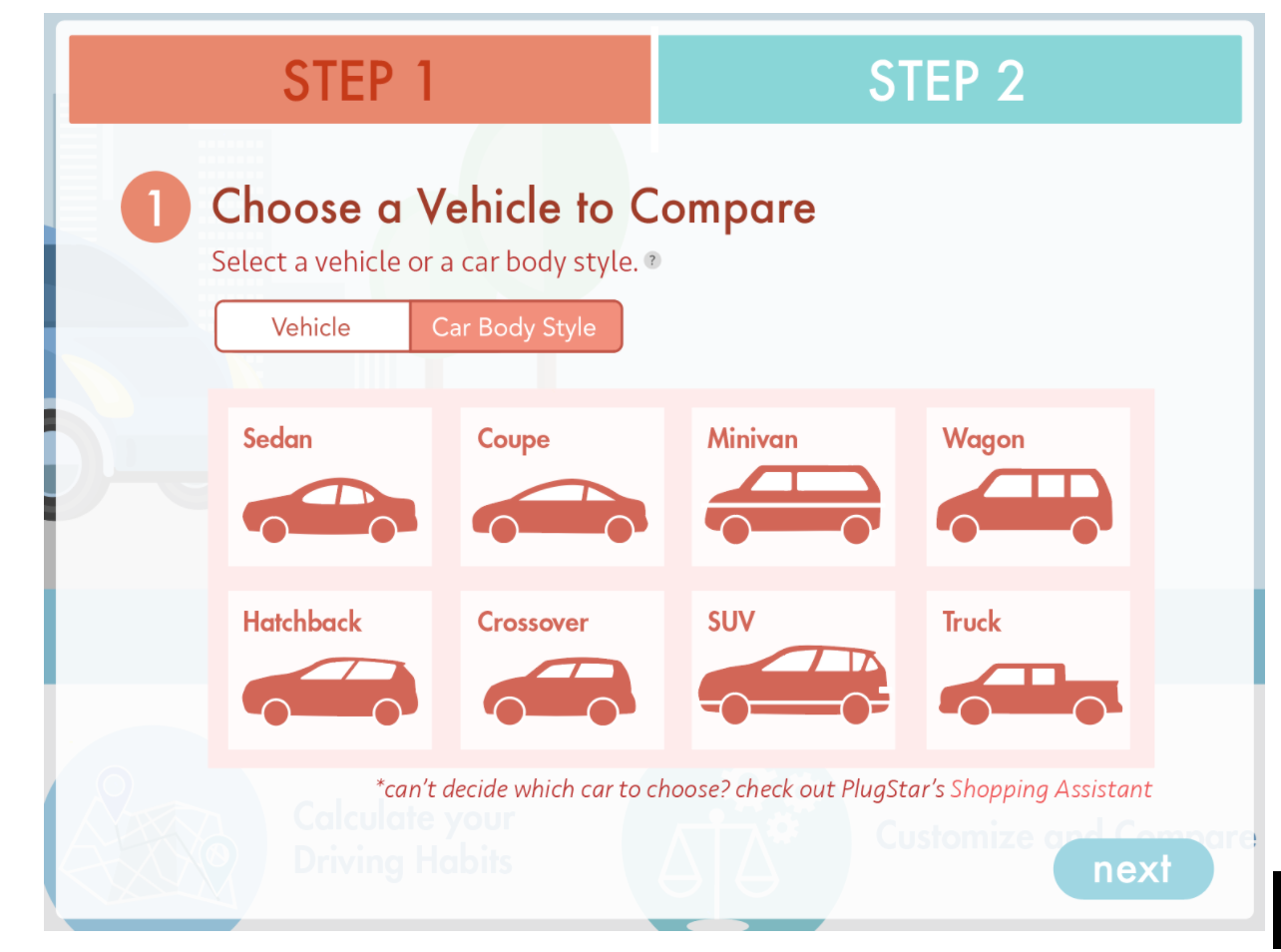
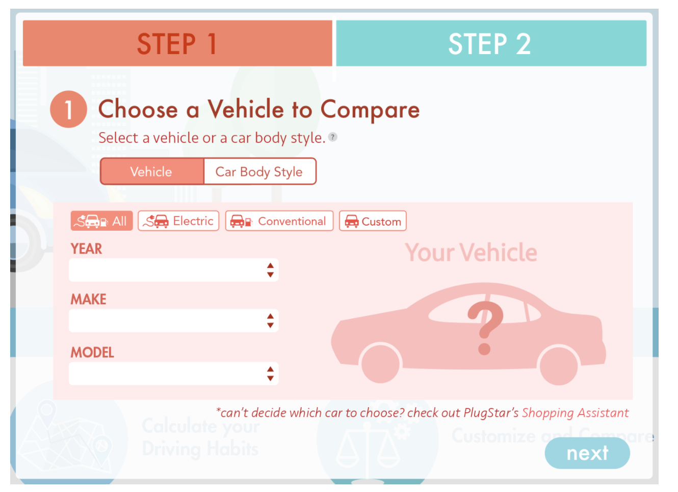
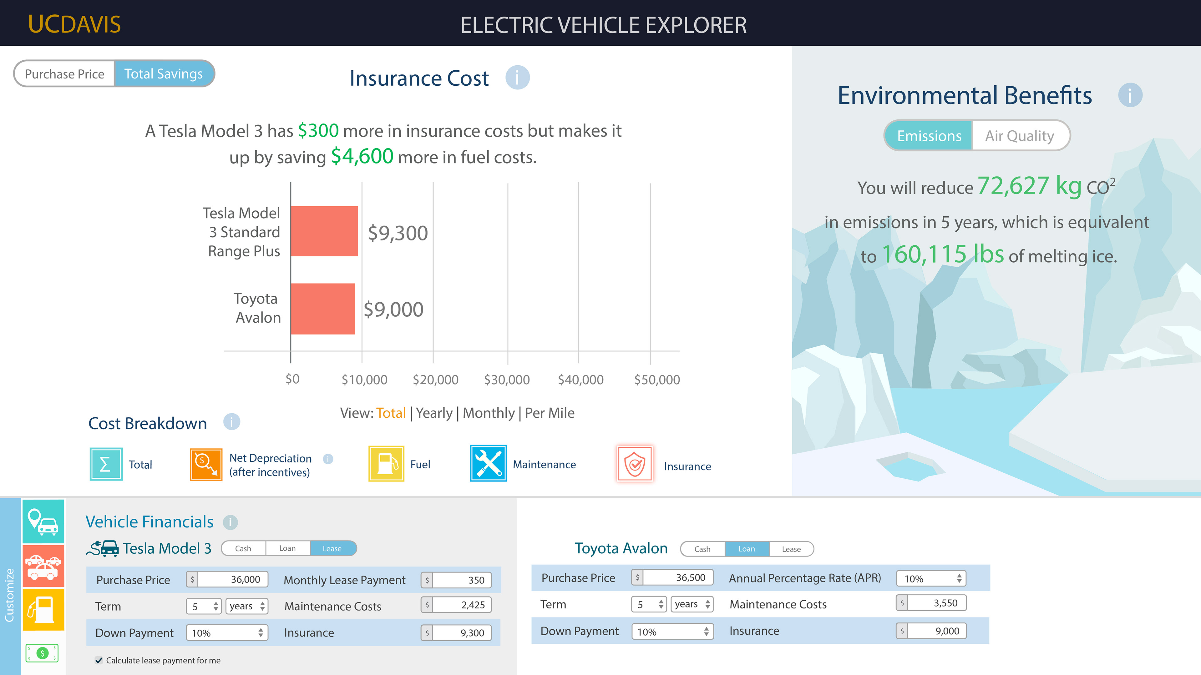
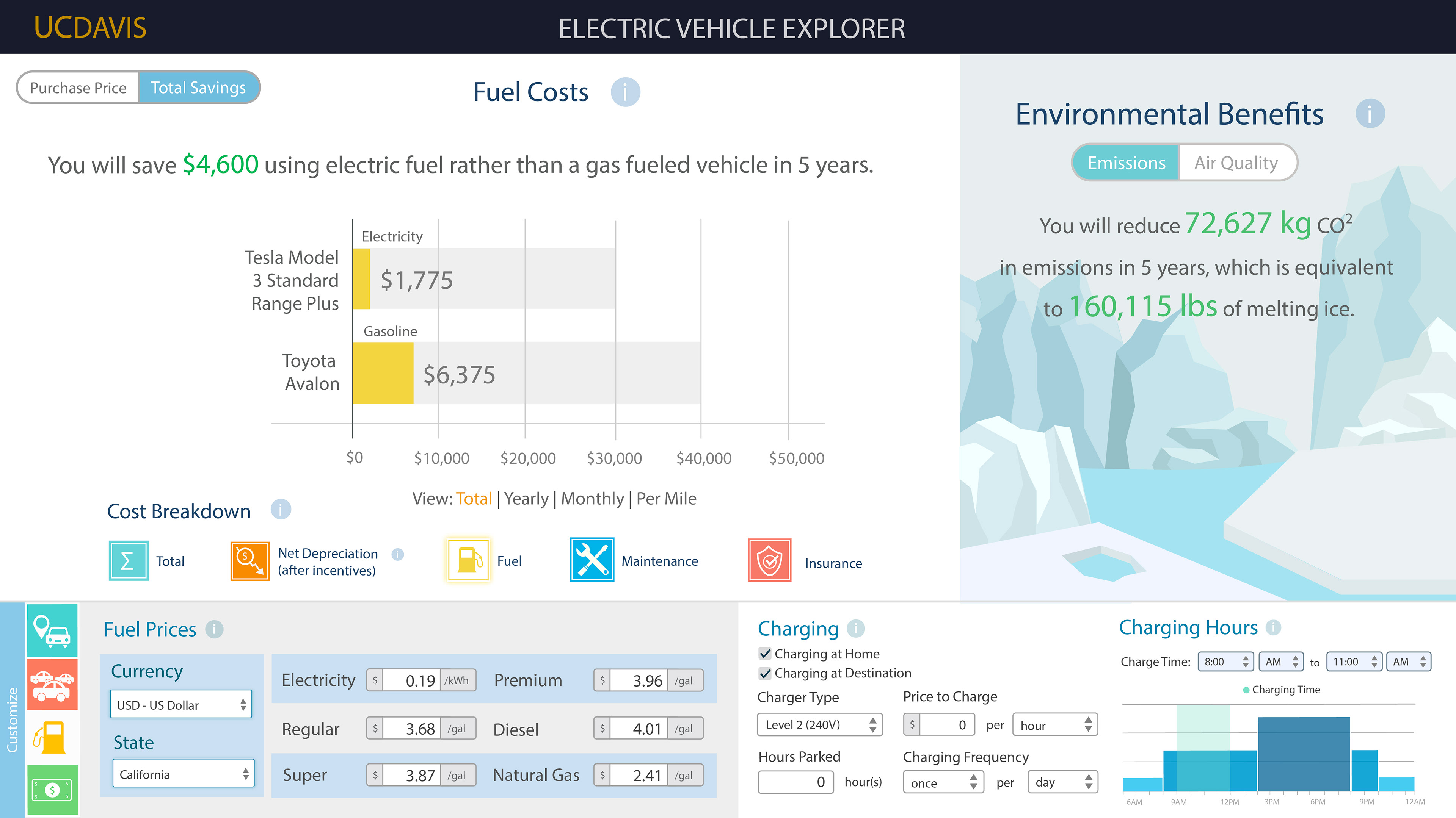
Usability issues were found with the visuals and interactions.
My Redesign
Before & After
Before & After
Before & After
Before & After
Interactions I designed
1.A Emphasize EV benefits (e.g., highlight operational cost savings for an EV vs. similar ICEV)
Vehicle costs informs users of the incentive amount they are eligible for at the top of the graph in green. Vehicle costs have three subsections that can be added onto the graph, which are the initial purchase cost, the incentive amount, and then the net cost after incentives. As you can see the layout of the graph highlights that overall purchase cost is actually not all that different from the gas car.
1.B Compare cumulative total costs overtime, highlighting breakeven time
This section is important as it highlights when the gas car becomes more expensive than the EV factoring in the total cost of initial purchase, maintenance, and fuel.
1.C Enable comparison of at least 4 vehicles
1.D Up-to-date federal, state, and local incentive estimates
Clicking on the bar graph for incentives will show users tax credits and financial incentives that they can get if they buy an EV.
2.A Integrate salient, emotionally-evocative information about social and environmental impacts
This section demonstrates the non financial benefits that come with an EV. It combines short GIFs and facts about environmental impact of gas cars. It quantifies the users carbon footprint while also giving concrete examples of consequences.
Motion Graphics
These are the three videos that are shown with EV Explorer 2.0. There are other VCCs out there, but most of them do not include the environmental benefits of driving an EV. This is vital to show possible buyers because there are plenty of times when the gas car will be cheaper than the electric. Showing users their environmental impact is an important part of the conversation and decision making process. I only designed the otter motion graphic, but I designed the prototype with the three of them together.
Final Stage Prototypes
Required Inputs: Vehicle Type
Required Inputs: Mileage
Outputs: Driving Costs
Outputs: Vehicle Costs
Outputs: Total Costs
Outputs: Social & Environmental Benefits
The End
Outcome
EV Explorer 2.0 was evaluated through online experimentation, gauging users’ perceptions—before and after using the website—of their current fuel costs, potential savings, attitude toward charging, and intention to buy or lease in the future. Statistically significant changes in each of these variables validate EV Explorer 2.0 as an educational tool and a persuasive eco-feedback intervention to promote the adoption of EVs.
Next Steps
Next steps are to complete and debug the new design features that will include total costs, loan and lease variations for vehicle costs.
User research will be done to test the effectiveness of our Vehicle Cost Calculator compared to others. According to Governor Newsom of California, gas vehicle sales will be prohibited after the year 2035. So our goal is to build the calculator in a way where it will be used as leverage to ease the transition to EV’s by highlighting the benefits for consumers.
Lessons Learned
1. Icons can be helpful visual aids, but it's important not to overuse them and to make sure they are whittled down to their most simple representation. They are most useful when they are in small groups and represent commonly understood concepts. Otherwise, it's better to use clear written language.
2. Colors should be restrained on dashboards. Data sets should be colorful and detailed to display complex information, but in order to support that data the rest of the site should be muted in color and visuals when grouping information.
3. It's better to use shades of the same color group and sizing to denote selection, interaction, and hierarchy. Throughout the site too many different colors and complicated icons were used to display information and hierarchy.
4. I should have considered ADA guidelines and factored that into the final designs. Looking back I can see contrast issues that would be difficult for people who have low vision, have migraines, or are color blind.
5. It's important to sit down with the development to discuss what assets they need to succeed in implementing designs and establish a clear line of communication.
6. I have learned much more about usability tests and UX research best practices since doing this project. For my usability test, I should have interviewed individuals who have gone through the process of buying a car.
